BRIANNE McGUIRE
 

Brand Development and Design Strategy

Brand not only reflects messaging and business direction, it DEFINES it. I have over 20 years of industry experience cultivating brand direction and articulating messaging to craft powerful designs and strategy. The integrity and efficacy of a brand ensure that opportunities are both identified and leveraged; vision is communicated successfully, awareness is fostered, and quality leads are generated.


Branding /
Product Development


CLIENT: GRAPHICPAINT, LLC
Product Development, Art Direction, Branding, Wireframing, UX/UI, Social Media Marketing

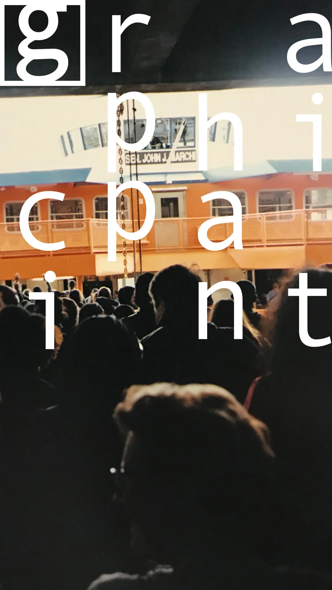
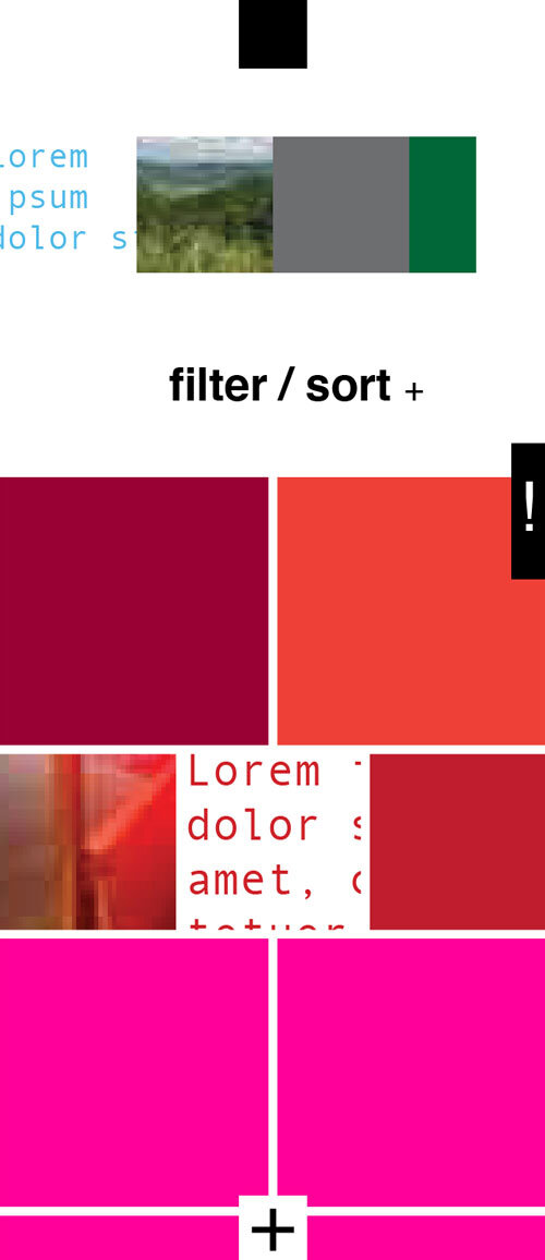
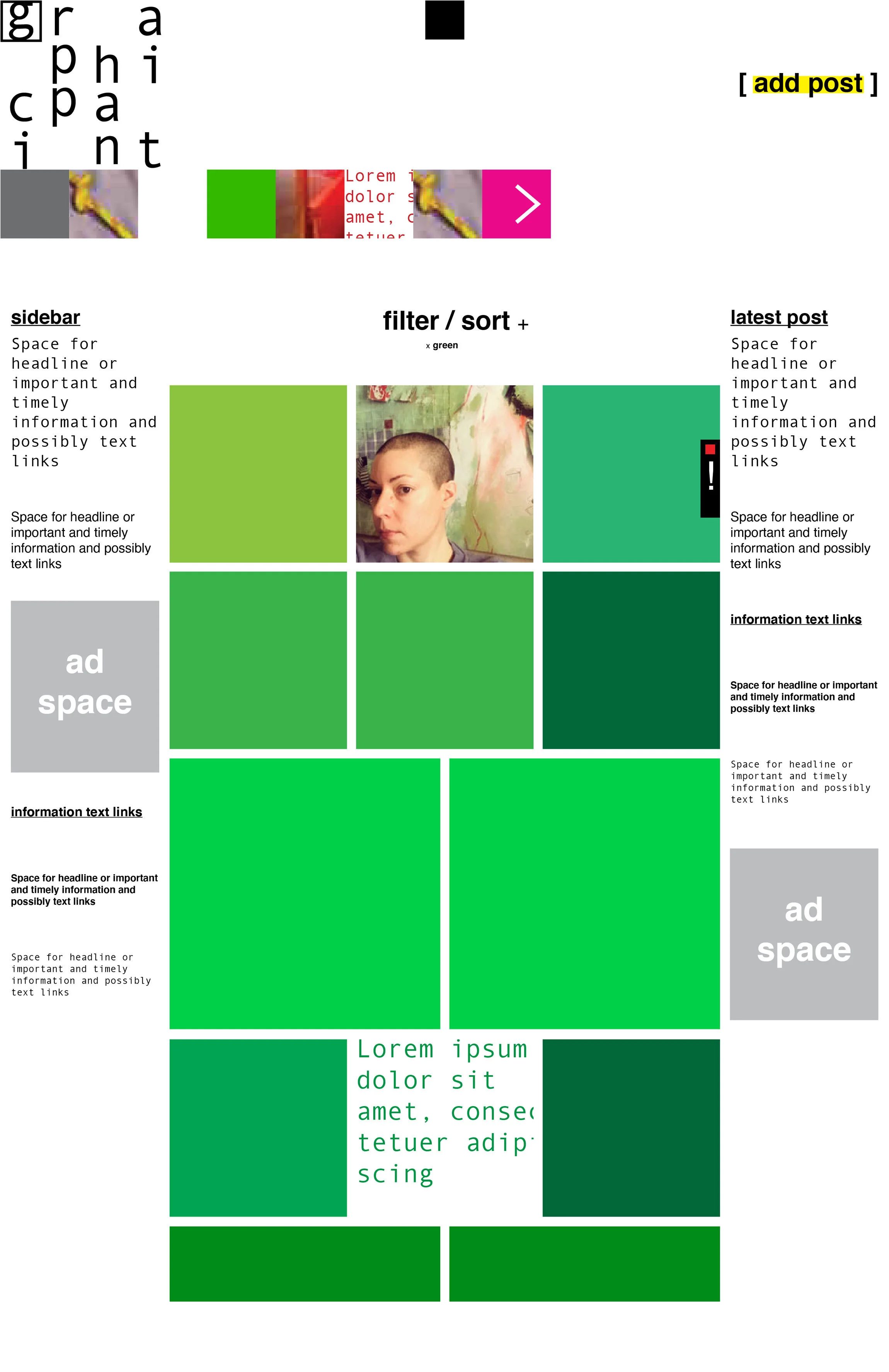
GRAPHICPAINT is a web-based platform for both original and crowdsourced media without sexual censorship. The site is being relaunched in Late Summer 2020 and currently in beta testing. This relaunch introduces innovative means of navigation and interaction while honoring the bold, “quietly crazy,” content-first ethos of the brand.

The GRAPHICPAINT logo embraces the appearance of chaos within a strict structure and white space that speaks to the crowdsourced focus of the application. The underlying grid of the logo served as the inspiration for the new site navigation.


Websites


CLIENT: Multiple Creative Artists
Art Direction, Branding, Site Builds, Content Strategy
A selection of mobile views. Sites shown:
JoelBrooksForJerseyCity.com
JakeSofaer.com
LindaPhillips-cd.com [password: Wordlover]
PeaceLoveAndFilm.com
EvelynKlie.com


Logos


CLIENT: Dead Simple Networks
Art Direction, Logo Design

1st round samples for independent tech company. Aesthetic inspired by technology, circuitry, simplicity and approachability.


CLIENT: Brooklyn Marathon
Art Direction, Logo Design

Samples created based on the range of creative direction that included: classic Brooklyn, 70's-style athletics and tattoo art as design influences.


CLIENT: Clean Sheet Media
Art Direction, Logo Design

Media company founded by avid soccer fans; the phrase "clean sheet" is a common soccer referee term and was the inspiration for the firm name. The logos created were developed based on this theme and the idea of modularity and agility of the media produced.